A logo is the most important part of brand identity, next only to the name of a brand.
The first step to designing a good logo is to know the customer and the customer’s target audience. Logo designing involves judging certain practical aspects and linked closely to this is the nature of company or organization for which the logo is being made. Different companies have different salient characteristics and it is crucial that the logo upholds the uniqueness of the brand it represents.
Designing a logo is that part of a branding process that is not meant to tantalize but to universalize a visual image of the brand. Since the primary purpose of a logo is brand identification, it must be original, distinctive and easily associated with the company name or with company product and reflect its values and philosophy.
A particularly insightful comment on the art of logo designing has been offered on the PBS series Off Book which explores the world of logos in depth. It states that logos “utilize a silent vocabulary of colours, shapes and typography to give a visual appeal to the identities of companies and organizations of all types.”
In the art of logo designing, simplicity is the key. Logo designing is by all means an art of effective communication. It involves constructing minimalistic designs that communicate with the world.
Logo is a general term.
The art of designing logos includes more specific terms: signature, mark and wordmark.
A signature is the name of the brand/organization set in a distinctive style or typeface.


A mark is a graphic design used to represent a company/organization.


A company's signature and mark are often used together, with detailed corporate rules for their display, but each can stand alone to symbolize the company.


A wordmark is a graphic design that includes the name of the brand into the design. When a mark and signature combination is broken apart into a mark and a signature both still represent the brand, but when a wordmark is broken apart, it loses its identification with the brand.


Be it a signature, mark or wordmark, all suggest something about the brand/ organization it stands for.
Since logos are a mark of identification it is inevitable that a logo must be adaptable to a variety of media. While designing logos, one of the things to be kept in mind is its legibility. All the possible uses of the logo have to be thought of or else it loses its legibility. Different logos have different usages depending of the brand they represent. For example logos for FMCG brands must be legible for printing on packages, bottles, carry bags, etc. On the other hand the logo of an automobile brand has to be embossed onto vehicles and need not be legible for printing on carry bags.
Making wise use of colour is another crucial aspect of logo designing. Cost of printing increases with use of more colours so it is wise to use screens or percentages of a single colour rather than different colours.
Previewing is essential since certain colours change dramatically when screened as a percentage of the base colour. For example red becomes pink which may be unacceptable.
Logo designing sure requires a good amount of tact and deep understanding of all the practical uses of a logo. However, a brand image is not made popular merely by the legibility and authenticity of its logo. It lies with the brand's successes in marketing strategies and overall performance to make its logo an image to reckon with.
Therefore it is not right to get bogged down with too much thought over the technicalities that go behind the creation of a logo. Design is a slippery subject and much of it is determined by taste. A logo has to be easily recognizable and project some amount of fun and personality - qualities few major corporate logos are allowed to convey in an often-serious business world.
Take the following logos for an example, would they be as interesting if their designers had only followed rules and not played around a bit to make them memorable?


Logo designing really does seem an easy task full of fun and innovation but for that precious masterstroke of timelessness, you need an expert.
For unique logo that suits you to a T, contact us today - mktg@studioblossoms.com
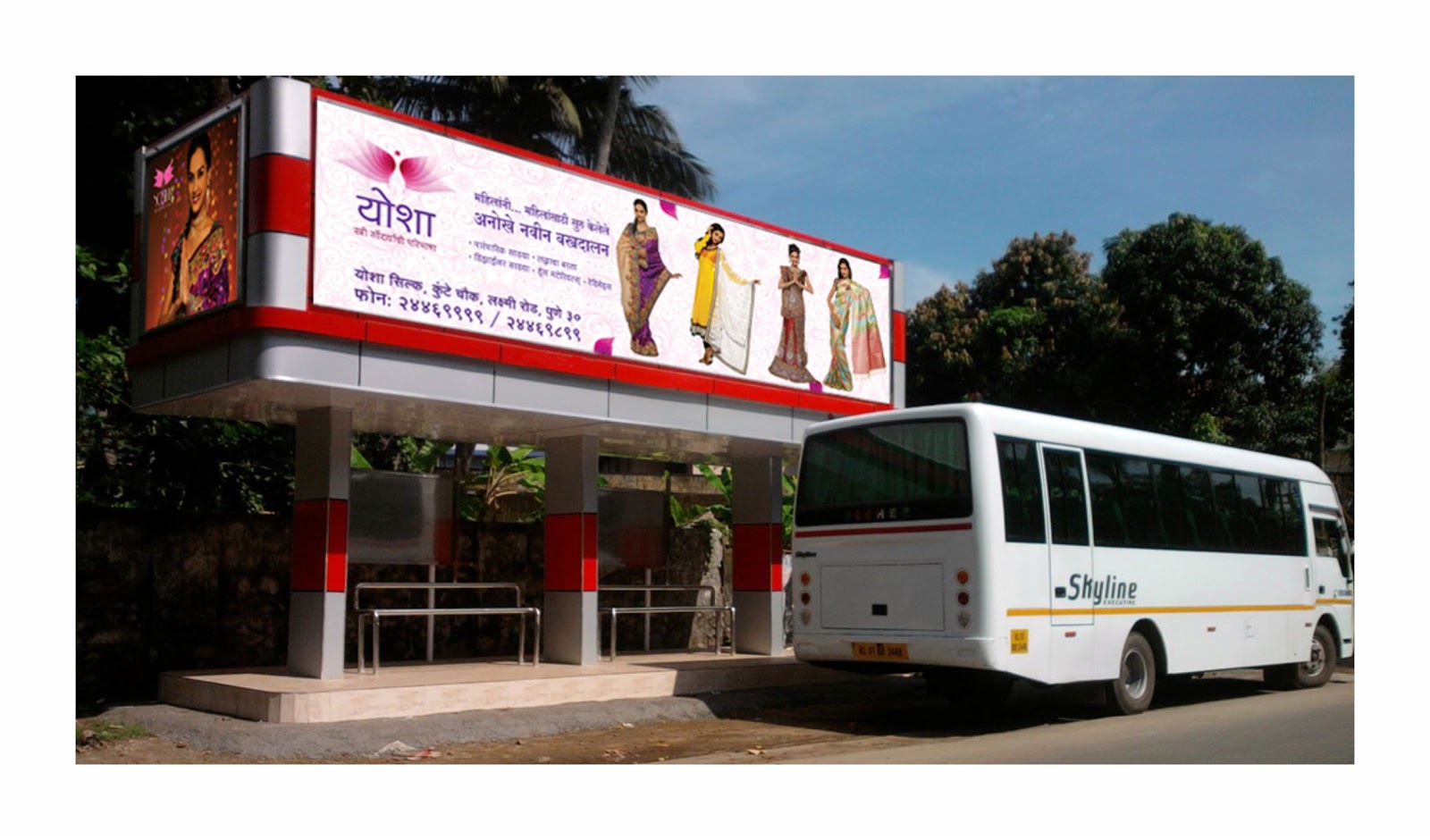
Few examples of logos designed by blossoms
http://www.behance.net/gallery/Retail-Branding-of-Yosha-%28Saree-Showroom-in-Pune%29/5704385
http://www.behance.net/gallery/Varad-Infra-Projects-Pvt-Ltd/5099495
http://www.behance.net/gallery/Corporate-Identity-of-Rohit-Springforms-Pune-India/4191185
For more visit - www.studioblossoms.com / www.behance.net/blossoms
The first step to designing a good logo is to know the customer and the customer’s target audience. Logo designing involves judging certain practical aspects and linked closely to this is the nature of company or organization for which the logo is being made. Different companies have different salient characteristics and it is crucial that the logo upholds the uniqueness of the brand it represents.
Designing a logo is that part of a branding process that is not meant to tantalize but to universalize a visual image of the brand. Since the primary purpose of a logo is brand identification, it must be original, distinctive and easily associated with the company name or with company product and reflect its values and philosophy.
A particularly insightful comment on the art of logo designing has been offered on the PBS series Off Book which explores the world of logos in depth. It states that logos “utilize a silent vocabulary of colours, shapes and typography to give a visual appeal to the identities of companies and organizations of all types.”
In the art of logo designing, simplicity is the key. Logo designing is by all means an art of effective communication. It involves constructing minimalistic designs that communicate with the world.
Logo is a general term.
The art of designing logos includes more specific terms: signature, mark and wordmark.
A signature is the name of the brand/organization set in a distinctive style or typeface.
A mark is a graphic design used to represent a company/organization.
A company's signature and mark are often used together, with detailed corporate rules for their display, but each can stand alone to symbolize the company.
A wordmark is a graphic design that includes the name of the brand into the design. When a mark and signature combination is broken apart into a mark and a signature both still represent the brand, but when a wordmark is broken apart, it loses its identification with the brand.
Be it a signature, mark or wordmark, all suggest something about the brand/ organization it stands for.
Since logos are a mark of identification it is inevitable that a logo must be adaptable to a variety of media. While designing logos, one of the things to be kept in mind is its legibility. All the possible uses of the logo have to be thought of or else it loses its legibility. Different logos have different usages depending of the brand they represent. For example logos for FMCG brands must be legible for printing on packages, bottles, carry bags, etc. On the other hand the logo of an automobile brand has to be embossed onto vehicles and need not be legible for printing on carry bags.
Making wise use of colour is another crucial aspect of logo designing. Cost of printing increases with use of more colours so it is wise to use screens or percentages of a single colour rather than different colours.
Previewing is essential since certain colours change dramatically when screened as a percentage of the base colour. For example red becomes pink which may be unacceptable.
Logo designing sure requires a good amount of tact and deep understanding of all the practical uses of a logo. However, a brand image is not made popular merely by the legibility and authenticity of its logo. It lies with the brand's successes in marketing strategies and overall performance to make its logo an image to reckon with.
Therefore it is not right to get bogged down with too much thought over the technicalities that go behind the creation of a logo. Design is a slippery subject and much of it is determined by taste. A logo has to be easily recognizable and project some amount of fun and personality - qualities few major corporate logos are allowed to convey in an often-serious business world.
Take the following logos for an example, would they be as interesting if their designers had only followed rules and not played around a bit to make them memorable?
Logo designing really does seem an easy task full of fun and innovation but for that precious masterstroke of timelessness, you need an expert.
For unique logo that suits you to a T, contact us today - mktg@studioblossoms.com
Few examples of logos designed by blossoms
http://www.behance.net/gallery/Retail-Branding-of-Yosha-%28Saree-Showroom-in-Pune%29/5704385
http://www.behance.net/gallery/Varad-Infra-Projects-Pvt-Ltd/5099495
http://www.behance.net/gallery/Corporate-Identity-of-Rohit-Springforms-Pune-India/4191185
For more visit - www.studioblossoms.com / www.behance.net/blossoms